Hi all,
Attached to this post is a very rough mockup containing 3 logo variations for a bisexual specific logo.
We'd like to see what members of the bisexual community think of them; so cast your vote in the poll above and feel free to comment any feedback you have - or suggest a different design altogether!
This will be used as reference material for our graphics designer to recreate and appropriately colour etc.
Cheers!
Bisexual specific logo - cast your vote
Which option do you prefer?
One seems less "binary" so more representative of those of us who describe as "pan" rather than traditionally bi. Some of us see our attraction in terms of "whoever attracts us" (they could be non-binary, for instance) rather than the binary "both men and women".
A woman goes shopping in the local mall. But what the heck is she shopping for in that outfit? My Festive Flash comp entry.
https://www.google.com/search?q=bisexual+logo&source=lnms&tbm=isch&sa=X&ved=2ahUKEwjX8uzn7eP1AhWKi1wKHYsGAa4Q_AUoAXoECAEQAw&biw=1920&bih=947&dpr=1
None of those 3 shout "bisexual" to me.
Is the first one a bow tie? Kind of looks religious.
They all look sterile.
Quote by nicola
https://www.google.com/search?q=bisexual+logo&source=lnms&tbm=isch&sa=X&ved=2ahUKEwjX8uzn7eP1AhWKi1wKHYsGAa4Q_AUoAXoECAEQAw&biw=1920&bih=947&dpr=1
None of those 3 shout "bisexual" to me.
Is the first one a bow tie? Kind of looks religious.
They all look sterile.
That's a good point, Nic. I'm not that fond of any of them, just thought One was the best of the lot.
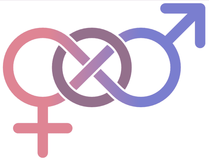
This is perhaps the best out of that search. There's a continuity there that, again, captures the broader notion of "bi" rather than the narrower "both men and women". It suggests "and everything in between".

A woman goes shopping in the local mall. But what the heck is she shopping for in that outfit? My Festive Flash comp entry.
The logo has to have pink, purple, and blue, because those are the colours of our flag. Good point though.
I know it's not an option as above, but the infinity style symbol above is lovely and is widely recognised.
It's difficult for me to see black on a white background, but out of the above options, number 1 is best but it needs to be much clearer.
My favourite is the infinity style symbol.
Quote by AvidlyCurious
For some reason, the arrows look too 'square' to represent bisexuality.
Because we bis are anything but square, eh. 😀 I think that's part of my problem with two and three. Aside from the rather binary connotation of the arrows, they are simply a bit ... ugly.
A woman goes shopping in the local mall. But what the heck is she shopping for in that outfit? My Festive Flash comp entry.
Ok to get the context for this logo you probably need to know a little more. We are about to launch a new website for bisexuals called swingsbothways (in the next few weeks). Across our sites we have about 2.5m Bi users and they will all get an invite to join it as founder members. This means they will have Platinum lifetime accounts forever and within 6 months be able to invite up to ten of their Bi friends to enjoy the same benefits. We have used the middle colour below for the site from the Bi flag, and obviously swings both ways means to be attracted to both sexes so it's a great domain name for it. So what you are looking at above it essentially a site logo for swings both ways so the logo needs to stand for bisexual as well as the site name (hence the arrows).
Okay, this is making more sense now. Not sure I am interested in a bi-specific site personally (after all, as a bisexual, I like interacting with all sorts of folks, not just my own orientation), but sounds like a site that should be happening.
A woman goes shopping in the local mall. But what the heck is she shopping for in that outfit? My Festive Flash comp entry.
Quote by Theredbaron
Ok to get the context for this logo you probably need to know a little more. We are about to launch a new website for bisexuals called swingsbothways (in the next few weeks). Across our sites we have about 2.5m Bi users and they will all get an invite to join it as founder members. This means they will have Platinum lifetime accounts forever and within 6 months be able to invite up to ten of their Bi friends to enjoy the same benefits. We have used the middle colour below for the site from the Bi flag, and obviously swings both ways means to be attracted to both sexes so it's a great domain name for it. So what you are looking at above it essentially a site logo for swings both ways so the logo needs to stand for bisexual as well as the site name (hence the arrows).
Loveeeee the colours, and obviously on board with concept! ![]() :worship:
:worship:


